The recently-released indie UK film 'Daggers Inn' - watched on Amazon Prime - has some well-placed chess imagery. In the main title sequence - above is a screen capture from that - a crystal chess set is depicted, along with a knife that is symbolic of later action in the film. The chess set itself repeatedly shows up as a centerpiece on the conference room table of the (evil) law firm at the hub of events in the English village.
Unlike in some other film examples, the chess set is set up correctly and the king is toppled in a later scene by one character in a parallel to the title sequence. The use of the chess board appears to reference the strategic play of the main character, who early on is alluded to be a witch, on a mission of revenge in the village. I gave the film a 4/5 and can recommend it for the proper use of chess imagery throughout.
This blog has occasionally highlighted pop culture chess imagery fouls, which are annoying to encounter, but sometimes are amusing, especially when sourced to creators who probably don't even play chess.
Something relatively new as a phenomenon in chess publishing (mostly online) is the posting of incorrect, sometimes even howlingly bad, chess imagery from chess professionals who are content creators (and should know better). The new-ish normal is that every blog post on the interwebs is expected to have an image at the top, regardless of whether it adds anything to the meaning of the content. I'll put up an image when it makes sense and adds to the post, for example showing a book cover or a chess diagram or a (real) person mentioned in the text.
Generative AI of course is increasingly used to provide images, but it is notoriously bad at chess (and apparently chess imagery as well). Professionals should at the very least do a quick blunder check on the images they are posting. One recent example is pasted below - count the different number of files for White (9) and Black (11) on the impossible chessboard.
At least this board setup, even if illegal, is physically possible, with the colors and the king/queen positions having been reversed. It's perhaps natural to have a bit of sympathy for an oops by an 1100-rated internet chess influencer that is willing to put herself out there at the National Open, compared with an IM who should really know better.
As an addition to previous commentary on pop culture chess imagery, thanks to @IMPERATOR_63 on Reddit (link above) there is now a new entry from the recently-released 007 First Light video game. The virtual setting is clearly a throwback/callout to the From Russia With Love chess tournament scene, although with a modernized board display. So props to the developers for that.
Of course with pop culture, it seems there is always something wrong with the depiction of chess. Here the row numbering is reversed, with A8 being in the lower-left corner. At least the position itself (if you ignore the coordinates) is a real one.
What's wrong with this picture? From Lady Gaga's performance at the Coachella festival:
The first thing I noticed was that the bottom side's colors were reversed. Then I noticed the top side's were correct. Then I started counting squares...
That said, powerful use of the chess metaphor in dance and song.
I randomly ran across the below recently, which are some more good examples of pop culture chess imagery - which is often wrong or misleading, so maybe not good.
This one I originally encountered in the article 10 Powerful Visuals You Need To See Before You Enter 2024 on Medium.com. It has a superficially valid chess metaphor: the queen looking at a mirror and seeing a pawn, as an illustration of "imposter syndrome" - but it seems to me that it doesn't really work. Visually there's the fact that it depicts a White queen is looking at a Black pawn, which doesn't make much sense in a chess context - switching sides is not an option for pawn promotion. There's also the overall squishiness about the imposter syndrome concept, so its depiction isn't necessarily clear.
The next one is a stock photo used to head the Medium.com article by Alexandru Lazar entitled Ten Habits that will get you ahead of 99% of people. You can find it various places on the internet, but the imagery is clear: a White king on a bare board knocking over his counterpart, normally done when taking a piece. A powerful-looking visual intended to convey supremacy - but in fact an illegal move in a position that is a forced draw. Authors who use faulty chess imagery like this tend to lose credibility instantly, at least with chessplayers, so here's a plea for people to avoid doing that.
In a short detour from the usual topics, I'd like to take a moment to explore (and deplore) the often annoying and occasionally truly awful depictions of chess in pop culture - including movies, TV productions, advertisements, and the like. Chess has an intellectual and often-times sophisticated image associated with it, although of course this is not always the case in real life. It's when things just appear wrong that it becomes annoying (or sometimes funny) to any chessplayer with a true love of the game.
The most frequent error - based on a lifetime amount of (unscientific) observation - is setting up the board wrong. It seems that the vast majority of the time I've seen a chess board on screen, it's not correct - something which should take a production assistant maybe a few seconds to verify, especially in the smartphone era. The two most common problems are the initial position of the pieces - often the King and Queen are switched - or when the board is turned 90 degrees, with colors reversed (the lower right square being dark rather than light).
Here's one of the top Shutterstock chess images, which demonstrates the first sin, reversing the king and queen:
An example of the latter sin, wrong board orientation/colors, can be seen in the lead pic of this post, taken from the blockbuster-budgeted Captain America: Civil War. At least the wood board and set are very aesthetic-looking and high end, with the pieces set up in correct order. It's a relatively subtle error, but I suppose it still doesn't bode well for Black Widow (Scarlett Johansson) and her allies that they can't set up their chessboard right.
Another cringeworthy (and more blatant) example of this is in the TED-Ed "A brief history of chess" video, which is intended to educate its audience about chess:
It's also relatively common to see random positions that could never happen in a real game, are illegal, or impossible things like multiple same-color bishops or pawns on your first rank. Those of us who recognize these gaffes may inadvertently laugh out loud, causing our non-chessplaying companions to wonder what is going on. This can be slightly embarrassing in, say, a business meeting, but it's really not our fault, is it?
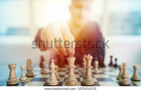
Business presentations are in fact an egregiously common example of chess-related blunders. I suppose consultants and others want to make dramatic and smart-looking statements, but they often just look silly. For example:
Like knocking over your opponent's king with your rook?
The above at least might show a real position, although it's not entirely clear from the visual. The below is worse, as the source article (from a chess-related domain, in fact) is about chess and business analysis, but it illustrates the idea with a randomly thrown-together board. This doesn't exactly convey an image of competence and deep understanding:
To provide at least some contrast, my favorite chess depiction (if not completely accurate), far and away, is the opening scene in the Bond movie From Russia With Love (1963). It shows a slightly modified position from Spassky-Bronstein, 1960. (You can tell it's from the 1960s by the ticking chess clocks and the fact you can smoke at the board.)
The Chess.com article on it is very thorough and one of the comments points out that the extended analysis based on the movie's game position has a flaw. Oh well.
Two other movies that get the feeling and most (if not all) of the details right:
The Luzhin Defense(2000), based on the Vladimir Nabokov novel. There is one major game inaccuracy depicted, according to the linked article, although the finale's combination sequence is correct.
2001: A Space Odyssey (Dave plays White; based on the position shown, he is not really very good, and of course loses to Hal 9000.)